Treble is a forward-thinking consultancy specialising in hospitality, tourism, and retail. Driven by agility, pragmatism, and fresh ideas, they break free from corporate constraints to deliver flexible, innovative solutions that help businesses—both established and new—thrive in competitive markets.
When we approached this project, the client had a few initial sketches that served as a starting point. Their favourite concept revolved around the idea of being the “three musketeers” of their industry—bold, resourceful, and ready to save the day. They wanted this sense of purpose and fun to shine through in their branding.
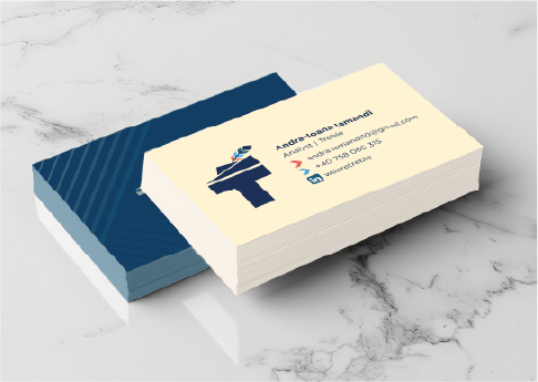
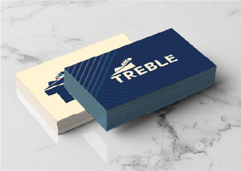
The result is a logo that balances classic sophistication with a playful nod to their vision. Strong lines and a clear, communicative font form the foundation, exuding professionalism and confidence. Sitting atop the bold name, a musketeer-inspired hat with three colorful feathers adds character and charm—perfectly capturing the essence of Treble as the agile, innovative heroes of their field.
With a simple logo, choosing the right font was crucial. The text needed to be strong enough to stand on its own while seamlessly supporting the image above, echoing its sharp lines and focus.
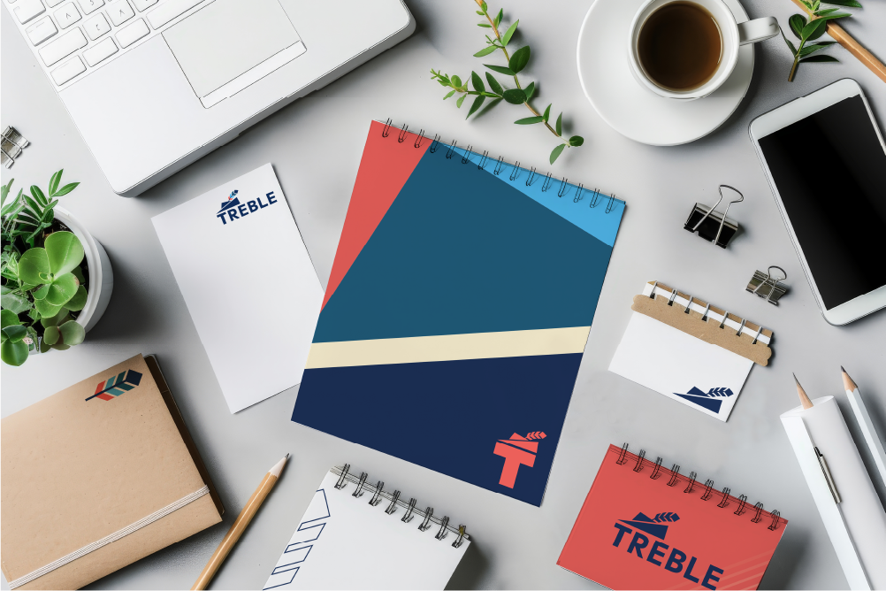
The final package delivered to the client included a logo, font selection, colour palette, and assets—providing a cohesive foundation for their website, social media presence, and presentation materials. This ensures a well-thought-out, consistent brand across all touchpoints.