The Valtona project began as a simple hobby that quickly grew into a popular order at the local bar. Valtona Mead is lovingly crafted at home near the banks of the Thames by a passionate ‘Viking,’ blending a deep respect for traditional Viking methodology with a modern flair for the craft of mead-making.
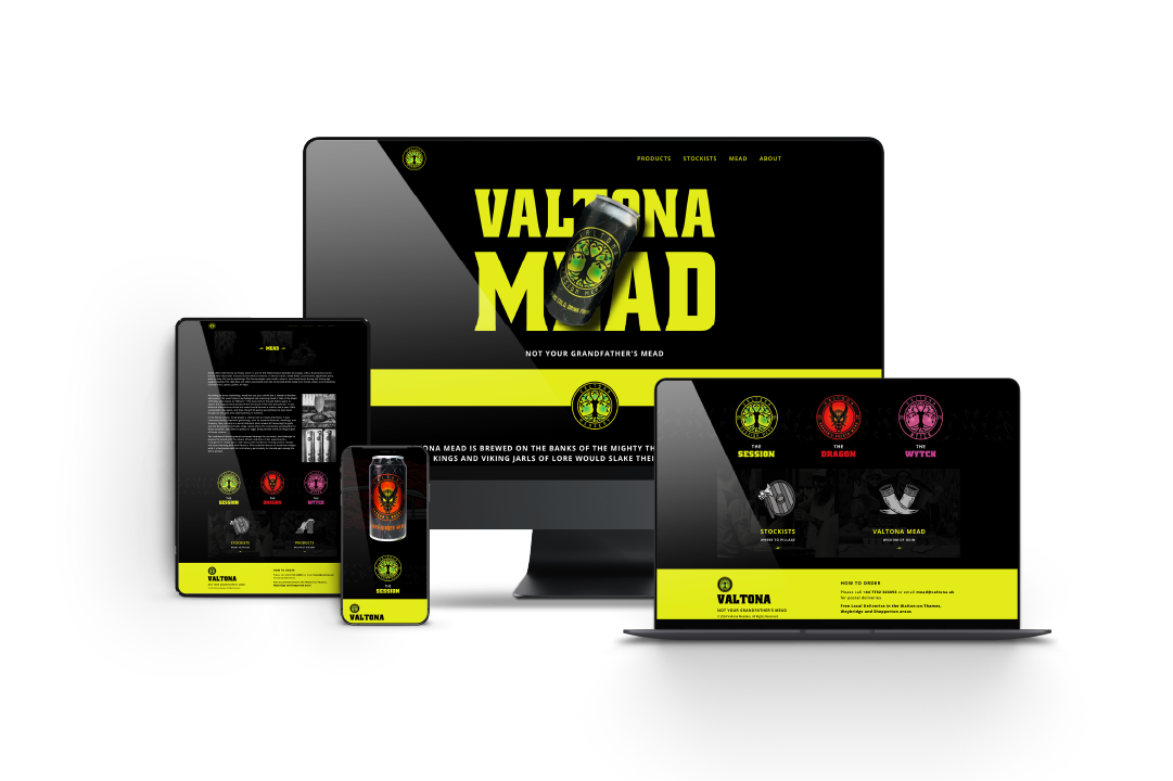
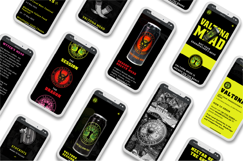
When the client approached me, they already had their initial branding in place. My role was to take their vision and expand it further, using the existing branding and ethos as a foundation. From designing a cohesive website to creating new merch designs and advertising materials, I brought their passion and Viking spirit to life across every element of the brand.
I was tasked with creating a cohesive brand identity, including branding, packaging, and website design, as well as developing assets for social media. We narrowed down their brand vision to three key components—healthy, convenient, and British-inspired.
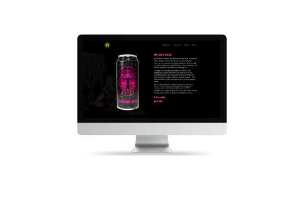
For this new brand, it was essential to communicate key messaging to consumers quickly, with a strong focus on the products themselves. However, with such a rich story behind Valtona, it was equally important to weave this narrative throughout the entire website—this isn’t just your usual mead.
The initial branding featured bold colours, which provided a great foundation for a striking dark and vibrant colour scheme that draws consumers in. Fun, illustrative graphics were subtly incorporated throughout the site, almost like peekaboo elements—adding just enough of the story without overwhelming or distracting from the real star: the delicious product.
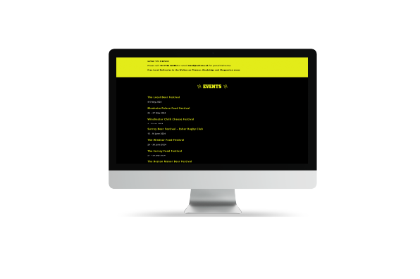
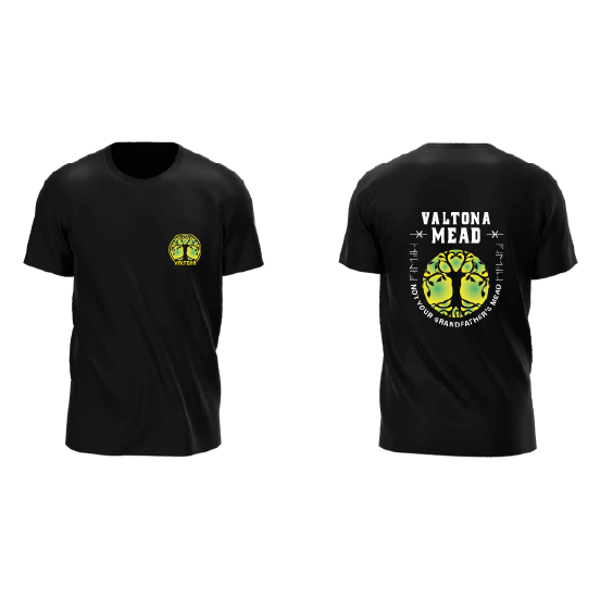
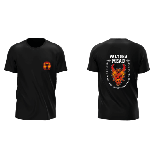
This narrative is woven into all marketing and promotional materials.
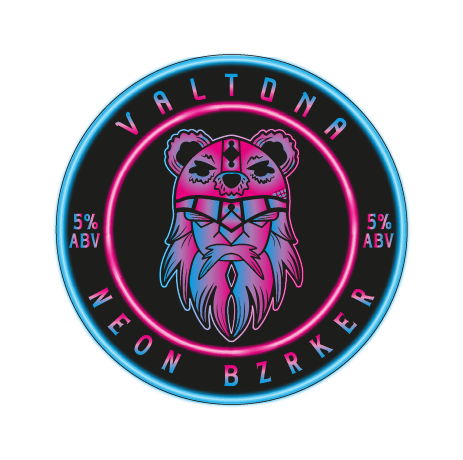
As the brand expanded, we collaborated on a new logo for an upcoming flavour—still in development, with more to be revealed soon.